Monday, November 20, 2017

Final Project: Flood Hazard Analysis


Introduction:

Flooding is an issue that affects many cities and towns located on rivers and other water bodies.  In order to prevent damaging effects from floods including property damage, economic loss on farm fields, and loss of human life, there needs to not only be an understanding of the mechanisms of floods, but also of flood history (Karatzas, 2017).  The Chippewa River Valley in particular has been subject to floods since settlers first came to the area (Wisconsin Historical Society, 2017).  As technology has advanced so have flood prevention measures and the ability to determine flood hazard zones.  However, these flood prevention measures are only as effective as the data they reference.  This data is hindered by an insufficient instrumental record of river levels (Therrel and Bialecki, 2015).  One way to recreate flood history before instrumental records is by using tree rings. When a tree experiences a flood under the right conditions, it will create a flood ring, which can then be observed in a tree core sample (Therrell and Bialecki, 2015).  This method is a new development in dendrochronology and flood rings have very specific conditions under which they form including the timing of the flood and growth in trees, the temperature, the total time the tree was inundated, and the species of tree. To support this relatively new and uncertain flood ring analysis technique, a flood hazard map of Wisconsin, including the area surrounding Brush Island in the lower Chippewa River valley, will be created showing which areas are most likely to flood and thus indicate which trees might have flood rings.

Methods:

In this analysis, five different data layers were used: rainfall layer, DEM of Wisconsin, soil characteristics layer, land cover layer, and a rivers and streams layer.  Each layer was projected in the NAD_1983_HARN_WI_TM projection which is specific to Wisconsin. The DEM of Wisconsin was used to create a slope layer, flow accumulation layer, and an elevation layer.   To obtain the rainfall layer, monthly averages of rainfall for cities in Wisconsin obtained from the NOAA National Climatic Data Center (2017) were transferred to Excel. Then using the Modified Fournier Index (MFI), an equation that sums the square of the monthly average rainfall divided by the yearly rainfall for all twelve months, an MFI indicator was created that indicates the sum of the average monthly rainfall intensity for an area (Figure 1). MFI is used because it has been determined to be acceptable for mapping rainfall intensity (Kourgialas and Karatzas, 2017). These were incorporated into a new field of a geocoded Wisconsin cities feature class and the spline method of interpolation created a raster of average monthly rainfall intensity because it is best for creating a smooth surface of varying data (Kourgialas and Karatzas, 2017). 
Figure 1. MFI equation.

Using spatial analyst, the slope raster function was performed on the DEM layer to determine slope in the study area.  Flow accumulation was obtained by first creating a flow direction raster (using the flow direction tool in spatial analyst) from the DEM and subsequently using the flow accumulation tool.  The soil characteristics layer had to be converted using the polygon to raster tool in order to create a raster usable in the analysis.  For the rivers and streams raster, a Euclidean distance tool created a gradient of distance from the river and stream network.  The rainfall, slope, flow accumulation, and rivers and streams layer all had to be converted from a floating point to an integer raster because weighted overlay analysis only works on integer rasters.  Then, the rainfall, slope, flow accumulation, and elevation rasters had to be projected into the correct coordinate system to perform the analysis. 

Finally, all the rasters had to be separated into four classes using the reclassify tool. The elevation, flow accumulation, slope, rivers and streams, and rainfall layer were all separated into four classes using the natural breaks method, which was used based in previous studies (Kazakis et al., 2015). Land cover and geology (soil types) are composed of descriptive classes, and so their classes were determined based on the research results of both Kazakis et al. (2015) and Kourgialas and Karatzas (2017).  Each of these layers was then inputted to an extension called analytic hierarchy process.  This extension creates a weighted value for each raster based on a table showing the importance of a variable relative to others.  The values for this table came from Kazakis et al. 2015 (Figure 2). 
Figure 2. AHP values for weighted overlay analysis.

 Then all seven rasters were imported to weighted overlay analysis, each raster was assigned its weight (as a percentage), and each class previously created with the reclassify tool was assigned a ranking of either 1, 3, 5, or 7.  The rankings were determined using both Kazakis et al. (2015) and Kourgialas and Karatzas (2017) as a guide.  Finally, the tool was run and a map was produced showing flood hazard areas for all of Wisconsin.  The work flow for this map is pictured below.
 
Figure 3. Workflow for creating the flood hazard map.

Results:


Figure 4. Flood hazard map of Wisconsin.


Figure 5. Flood hazard map of the area surrounding Brush Island.


 The final product shown in figure 4 was a flood hazard analysis map of the state of Wisconsin with four categories: very high, high, medium, and low.  The categories were determined using ranks and weights assigned to each variable via analytic hierarchy process and previous research.  Figure 5 shows that the area surrounding Brush Island, the area where tree cores were obtained for recreating a flood history of the Chippewa River, is completely encased in the very high flood zone.  This indicates the Brush Island has a high likelihood of flooding and thus the trees are likely to contain flood rings.  In general, areas surrounding rivers like the Chippewa River are more likely to flood than areas farther away.  The lower half of Wisconsin is also generally more susceptible to flooding based on figure 2. Important to note is the raster analysis was limited by the 30 meter DEM and thus the precision of the findings is limited. 

Conclusion:

Figure 3 shows that the Brush Island area is likely to flood based on the raster analysis performed.  This indicates that tree cores from the island are likely to have flood rings and validates previous predictions that obtaining tree cores from this area will yield flood rings. Tree ring data from Brush Island can then be used to recreate a flood history of the Chippewa River before instrumentation records were present.  This data combined with instrumentation records will give government officials and other groups a more complete and comprehensive flood history that can be used for planning, insurance policies, and future flood prevention measures.  While the raster data used for this analysis is recent (DEM, soil characteristics, flow accumulation) and the flood rings are dated farther back, the Chippewa River has not drastically changed in the last 200 years and thus general comparisons and analysis can be done using previous flood data (tree rings) and recent raster data.  The final raster was limited by its 30 meter DEM and limited rainfall data so fine scale analysis is not possible, but general trends can be determined.  This map is recommended for general use and coarser scale trends in flood hazard analysis of Wisconsin. 

Sources:

NOAA National Climatic Data Center. (2017). NOAA’s 1981-2010 Climate Normals [data file]. Retrieved from https://www.ncdc.noaa.gov/cdo-web/datasets/NORMAL_MLY/locations/FIPS:55/detail

Current Results Publishing Ltd. (2017). Average Precipitation for Wisconsin. Retrieved from https://www.currentresults.com/Weather/Wisconsin/precipitation-january.php

Wisconsin Department of Natural Resources. (2017). DNR Geodatabase. (Geodatabase). Wisconsin: Wisconsin Department of Natural Resources. Web. 23 Sep 2017. http://dnr.wi.gov/maps/GetGISData.html

Therrell, M. D., & Bialecki M. B. (2015). A multi-century tree-ring record of spring flooding on the Mississippi River, Journal of Hydrology, 529(2), 490–498. doi:10.1016/j.jhydrol.2014.11.005.

Xiao, Yangfan, Shanzhen, Yi, Zhongquian, Tang. (2017). Integrated flood hazard assessment based on spatial ordered weighted averaging method considering spatial heterogeneity of risk preference, Science of the Total Environment, 599-600, 1034-1046. http://dx.doi.org/10.1016/j.scitotenv.2017.04.218

Kourgialas, N.N., & Karatzas, G.P. (2017). A national scale flood hazard mapping methodology:The case of Greece- protection and adaptation policy approaches, Science of the Total Environment, 601-602, 441-452. http://dx.doi.org/10.1016/j.scitotenv.2017.05.197

Kazakis, N., Kougias, I., and Patsialis, T. (2015). Assessment of flood hazard areas at a regional scale using an index-based approach and Analytical Hierarchy Process: application in Rhodope-Evros region, Greece, Science of the Total Environment, 538, 555-563.http://dx.doi.org/10.1016/j.scitotenv.2015.08.055

Wisconsin Historical Society. (2017). Floods in Wisconsin. Retrieved from             https://www.wisconsinhistory.org/Records/Article/CS2507

Friday, November 3, 2017

Lab 2- Watershed Analysis

Part 1: Delineation of Watersheds

Background


A watershed is an area of land that drains all water that falls within it to a common outlet (USGS, 2016).  Watershed boundaries are areas of raised elevation that separate the flow of water across land area.  Knowing the boundaries of a watershed is important for land and water management.  Watershed maps including watershed boundaries can help those who work with them pinpoint pollution sources, monitor the amount and quality of water entering a certain area and much more.  A good example is Adirondack Park, a protected area in northeastern New York.  Many portions of the park are privately owned and used for forestry, agriculture, and recreation.  Understanding the flow of water through this park is helpful due to its wide variety of uses.  The water flow of Adirondack Park will be determined by performing a watershed delineation of the park area on ArcGIS.

Methods


First data was downloaded from the New York State GIS Clearinghouse, Cornell University's Geospatial Information Repository, and ESRI.  To prepare the data for the watershed delineation tool, it had to be processed.  The hydrology layer, which includes streams and rivers, was projected to (UTM) Zone 18N NAD 1983, the same projection as the Adirondack Park boundary because in order to perform an overlay analysis, all layers need to be in the same projection.  Next, a 20 km buffer was made around the park boundary creating a larger area for clipping the elevation dataset which will help make smoother watersheds later. The projected hydrology layer was then clipped to the park boundary, our area of interest. 
The DEM of North America needed for the analysis was obtained from ArcGIS Online.  The DEM was projected into the same projection as the park boundary and hydrology layer using a bilinear resampling technique (60 meter cell size), and then clipped to the buffered park boundary. 
Several input datasets were created to perform watershed delineation including flow direction, filled sinks, water accumulation, source raster, and stream links. The flow direction raster was created using the spatial analyst toolbox and the tool ‘flow direction.’  The fill tool was used to fill depressions impeding water flow and then a flow direction raster was made based on the filled DEM. With the filled flow direction raster, flow accumulation was calculated as an integer raster. 
A source raster was creating using the Con tool in the spatial analyst toolbox that served as the input for the watershed delineation. This raster requires choosing a stream threshold.  A stream threshold is the minimum number of cells flowing into any cell before it is designated as a stream cell.  For the first map, 50,000 was chosen.  Using the stream link tool, unique identifiers to each stream reach were assigned in a raster which will show unique stream links that resemble stream channels.  Finally, the Watershed tool created a watershed map using the flow direction and source raster.  For analysis purposes, the watershed raster was clipped to the park boundary and streams were added to compare watershed boundaries and stream locations.
 For comparison, the watershed analysis was repeated for a 120 meter cell size and stream thresholds of 100,000 and 500,000.

Results


Figure 1. Watershed analysis using a 60 meter cell size and 50,000 stream threshold.


Figure 1 shows the final map of 105 different watersheds in Adirondack Park.  Moving from north to south on the map, there is an increase in the stream outflow from each watershed (shown by the darker shades of red). 
Figure 2. Watershed analysis using 120 meter cell size and 50,000 stream threshold.


Figure 2 shows that the 120 meter cell size DEM decreases the amount of watersheds shown versus the 60 meter cell size.  This is because a bigger cell size means the processes are run on a more generalized DEM, and so the watershed boundaries will also become more generalized. 
Figure 3. Comparison of a 100,000 and 500,000 stream threshold in a watershed analysis.


Figure 3 shows that when the threshold was changed to 100,000, the number of watersheds decreased to 38 and when the threshold was increased to 500,000 the number of watersheds decreased to 7.  The results vary because as you increase the threshold for stream initiation, you decrease the number of stream cells.  In essence, you are increasing the required number of cells flowing into another to be considered a stream cell. 


Overall, this analysis depends on several factors, and depending on the values inputted for each factor, the output can show different results.  Two of these factors explored in this lab were DEM cell size and stream threshold.  Care should be taken when creating maps using tools like watershed delineation so that the final map fulfills its intended purpose as clearly as possible.  For example, a scientist might want a fine detailed watershed map whereas a poster for the general public may need to be more generalized.  These are things the map maker must consider when performing a watershed analysis.

Sources


U.S. Geological Survey. What is a watershed? (2016, December 09). Retrieved from https://water.usgs.gov/edu/watershed.html
New York State GIS Clearinghouse. (2017). Adirondack park boundary [Shapefile]. Retrieved from http://gis.ny.gov/
Cornell University Geospatial Information Repository. (2017). Hydrography features of New York state [Shapefile]. Retrieved from http://cugir.mannlib.cornell.edu/index.jsp

Part 2: Finding Areas at Risk of Flooding in a Cloudburst

Background


Recently, the country of Denmark has been subject to numerous cloudbursts.  The Merriam-Webster dictionary defines a cloudburst as a sudden heavy rainfall (Merriam-Webster, 2017).  One of these cloudbursts occurred on July 2, 2011 in Copenhagen causing widespread flood damage.  To prevent further damages from cloudbursts in the future, the Danish government established a Task Force on Climate Change Adaptation.  This task force utilizes a bluespot map, which identifies low-lying areas that have no natural drainage.  These areas may fill up and overflow, damaging nearby infrastructure during a cloudburst event.  This lab describes a geoprocessing model, a collection of input data and tools organized as a workflow and run as a single operation, which finds locations of bluespots and calculates volumes of bluespots and their capacity to hold sudden influxes of water (ESRI, 2017).

Methods


First, the Cloudburst Models and Data for the project was downloaded from ArcGIS Online, which contains two geoprocessing models: ‘identify bluespots’ and ‘identify bluespot fill up values.’  Like part one, the DEM used in this portion had a buffer zone, in this case 5 km, to ensure that all bluespots and watersheds were identified correctly because some bluespots and their local watersheds may lie partly in neighboring municipalities. 
First the ‘identify bluespots’ model was utilized.  This model found the bluespots on the DEM, processed this result and the buildings layer, and then selected the buildings on the map that were within or adjacent to bluespots. This model was premade by ESRI, so the only necessary steps were to check the model’s inputs and tools and validate the model before it was run. 
This model has several steps to create the final map of infrastructure affected by bluespots.  The first step of the model is taking the DEM of the Gentofte municipality in Copenhagen, Denmark and running the fill function to fill all sinks that may occur in the DEM. Concurrently the same fill function is run, but with a vertical accuracy input that will give an output raster of filled sinks less than the DEM vertical accuracy.  The two outputs are then subtracted to find the cell differences for the DEMs and thus create bluespot depths cell by cell.  Then the Con function performs a true/false test, assigning a 1 (true) value to cells that are a bluespot and 0 (false) to non-bluespot cells. Then the region group function assembles all bluespot regions by identifying the cells that had a 1 value assigned to them.  These bluespots were then converted from raster values to polygons, and then the bluespots were dissolved into one polygon. The dissolved bluespots were made into a temporary feature layer for selecting buildings affected by bluespots. 
The other input for selecting buildings affected by bluespots was created by taking the buildings feature class and converting only the buildings in the study area from polygons to a raster and then back to polygons.  These polygons were then made into a temporary feature layer as well. 
Both of the temporary feature layers were used to select buildings that intersected bluespots to create the final output of infrastructure affected by bluespots created by cloudburst events.  Out of all the buildings in Gentofte, approximately 46% were touched by bluespots, meaning they have some level of flood risk in a cloudburst.
The second model used was ‘identify bluespot fill up values.’ This model identifies bluespots on a DEM and calculates how much rainfall is needed to make each bluespot fill up in a cloudburst.  It does this by dividing the volume of a bluespot by the the area of the watershed.  This information can then be used to assign hazard levels to infrastructure based on how fast bluespots fill up.
 To determine buildings within the highest risk category, a query found the bluespots that fill up with 20 millimeters or less of rainfall.  Then, another query was used to find the buildings that intersect these bluespots.  The same process was used for a fill up value of up to 40 millimeters to show buildings within the top two risk categories.  These both were mapped in figure 3. 
To understand the relationship between watersheds and bluespots, the watershed layer was added to the previous maps.  The watersheds were also symbolized with discrete colors to differentiate between watersheds. Finally, feature classes of railways and roads were added to the map with the bluespots.  A query found the bluespots that require 40 millimeters or more to fill up, and then select by intersection was used to find railways and roads that intersect the selected bluespots.  The final result is a map of roads and railways that are at relatively low risk for flooding. 

Results

Figure1. Buildings affected by bluespots in the Gentofte municipality, Denmark.


Figure 1 shows a map of buildings touched or affected by bluespots and the corresponding bluespots.  These bluespots are spread out over all of the Gentofte municipality evenly without clustering. The even dispersion of the bluespots suggests that all of the Gentofte municipality is at risk for bluespots. This map only shows buildings affected, but it should be noted that there are other types of infrastructure affected by bluespots not pictured on the map. In addition, this model does not address the level of risk to buildings, only that the picture buildings are at risk.  The ‘identify bluespot fill up values’ model addresses level of risk to buildings and other attributes of bluespots. 
Figure 2. Levels of risk for buildings affected by bluespots in Gentofte municipality, Denmark.


Figure 2 shows the levels of risk for each building in a bluespot that was found via the ‘identify bluespot fill up values.’  This is visualized using red values for high risk areas and yellow for lower risk areas. Further analysis was run on this map to show buildings in both the highest and the top two highest risk categories and are shown in figure 3.
Figure 3. (A) Buildings in the highest risk category of bluespot flooding. (B) Buildings in the two highest risk categories of bluespot flooding.


Figure 4 shows the bluespots as they relate to watersheds.  This map allows the reader to examine the relationship between bluespots and the areas that provide the flow feeding them. 
Figure 4. Watershed and bluespot comparison in Gentofte municipality, Denmark.


Figure 5 is the final map created in this lab and shows roads and railways that are at relatively low risk for flooding (it takes more than 40 millimeters for the bluespots to fill up). 
Figure 5. Railways and roads at low risk for flooding by bluespots.


Figure 5 and figure 3 show that with the ‘identify bluespot fill up values’ model, it is possible to run more complex analyses, such as finding infrastructure that is at high and low risk for flooding due to bluespots.  It should be noted however that this model still leaves out many factors, such as the contribution of surplus runoff to a downstream bluespot and elevation of buildings within a bluespot. 

Discussion


As cloubursts and other large precipitation events become more common, it is imperative that governments at all levels make an effort to prepare their jurisdictions for the impacts of these events.  This case study of the Gentofte Municipality of Denmark is a great example of the first step in preparing for hazards: determining where they occur and the level of impact.  With this data, the government can find areas that need extra precautionary measures taken such as flood insurance, improved drainage systems, and choosing building sites away from bluespots.  The model should be globally applicable as well because it is based on investigation of the terrain surface and location of buildings. All one needs to do is make the input layers their own datasets and run the model.  Caution is advised when looking at the results of these models for a number of reasons.  The elevation of the bases of the buildings varies, so the results may show too many or too few buildings affected by bluespots.  The model also assumes perfect runoff conditions, but these are rare in real life.  Finally, assumptions have been made about the capacity of the sewer system to handle overflow water, so bluespots may act differently depending on the cloudburst event.  Overall, these models provide great insights on the behaviors of bluespots and the likely areas affected as long as caution is taken when interpreting the results. 

Sources

ESRI Learn ArcGIS (2015). Cloudburst models and data [Geoprocessing Sample]. Retrieved from http://www.arcgis.com/home/group.html?id=6b43edd251e54e0299c68695321b223e&start=1&view=list&sortOrder=asc&sortField=title#content
Merriam-Webster. Cloudburst. (2017, November 01).  Retrieved from https://www.merriam-webster.com/dictionary/cloudburst


Lab 3: Geodatabase Development

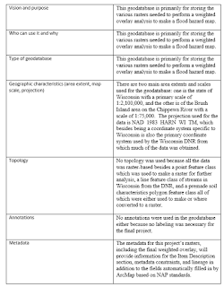
Background: Since the release of ArcGIS 8, the geodatabase model has been the primary means of storing geographic data (Price, 2016). ...